Browsed by
Category: Blog

Growth is good, isn’t it?

Growth is good, isn’t it?

Growth is good sounds like a marketing rule but the story of one famous British brand suggests otherwise.

That brand’s story begins in 1856, when a 21-year old, former draper’s apprentice called Thomas Burberry opened a store focusing on outdoor clothing. In 1880, he introduced gabardine, a hardwearing, water-resistant yet breathable fabric into his jackets and coats. 

In 1911, Burberrys as it then known were chosen as outfitters for Roald Amundsen’s expedition to the South Pole. Perhaps the biggest turning point for the brand came in 1914, when Burberrys were commissioned by the War Office to adapt its officer’s coat to suit the awful conditions in Belgium and France. The result was the “trench coat”. 

After the war, the trench coat became popular with civilians and in the 1920s what was to become the iconic beige Burberry check was created. It was used as a lining in the best-selling trench coats.

In 1955 Burberrys was taken over by Great Universal Stores who instigated a period of innovation in a drive for growth. Base products like the trench coat, the Piccadilly raincoat and the Cashmere scarf were all relaunched, all with much greater focus on the Burberry check. Burberrys became one of the most sought after luxury clothing brands in the world, worn by a host of stars including Humphrey Bogart, Audrey Hepburn, Peter Sellers and Ronald Reagan

During the 70s, 80s and 90s wanting to exploit the appeal of the brand, Burberry started signing more and more licensing agreements with manufacturers from all around the world, to (mass) produce new, and what they hoped were complementary items. These included suits, trousers, shirts, sportswear, accessories but also pet-ware, baseball caps and buggies.  Nearly all featured the beige check. 

However as the new century arrived the image of the brand started to decline, rapidly and dramatically. Burberry went from being perceived as a premium, luxury brand to one that anyone and everyone could, and did, wear. 

Burberry became associated with “chav” culture, a term defined in the Oxford English Dictionary as “a young lower-class person who displays brash and loutish behaviour and wears real or imitation designer clothes”. The availability of lower priced products and the proliferation of counterfeits that ‘borrowed’ the Burberry’s check, as well as adoption by B,C and D-list celebrities and football hooligans wasn’t consistent with an exclusive premium image. 

A much publicised photo of a former ‘star’ of television soap-opera ‘Eastenders’ in 2003 prompted one commentator to write “admirers of Burberry’s trademark check sighed and slung it to the back of the wardrobe after Daniella Westbrook, a self-confessed addict, publicly overdosed on Burberry”

In 2006, there were changes at the top of Burberry.  Rose Marie Bravo, the Chief Executive who had led to the brand to mass market “success” through licensing, retired. 

Angela Ahrendts replaced her and when later interviewed by the Harvard Business Review she remembered the early days of her tenure… 

When I became the CEO of Burberry, in July 2006, luxury was one of the fastest-growing sectors in the world. 

With its rich history, centred on trench coats that were recognized around the world, the Burberry brand should have had many advantages. 

But as I watched my top managers arrive for our first strategic planning meeting, something struck me right away. They had flown in from around the world to classic British weather, grey and damp, but not one of these more than 60 people was wearing a Burberry trench coat. 

I doubted that many of them even owned one. If our top people weren’t buying our products, despite the great discount they could get, how could we expect customers to pay full price for them?”


She was quick to identify the root of the problem

“(Burberry) had lost its focus in the process of global expansion. We had 23 licensees around the world, each doing something different. We were selling products such as dog cover-ups and leashes. One of our highest-profile stores, on Bond Street in London, had a whole section of kilts. There’s nothing wrong with any of those products individually, but together they added up to just a lot of stuff—something for everybody, but not much of it exclusive or compelling.

In luxury, ubiquity will kill you—it means you’re not really luxury anymore – and we were becoming ubiquitous.”

There was no central control, different factories around the world were doing their own thing, and in many cases they didn’t even feature coats. Ahrendts set about changing things.

She appointed the designer Christopher Bailey as the “brand czar” and gave him the ultimate say in the brand look and feel “I told them ‘Anything that the consumer sees—anywhere in the world—will go through his office. No exceptions.’ “

She closed the factories in New Jersey and Wales – the latter had been making polo shirts—and began re-investing in the Castleford facility, which made the heritage rainwear. She and Bailey also took the brand back to its origins:

“When I became CEO, outerwear represented only about 20% of our global brand business. Fashion apparel and check accessories were leading our strategy.

Surveying the industry, we realized that Burberry was the only iconic luxury company that wasn’t capitalizing on its historical core. We weren’t proud of it. We weren’t innovating around it.

The decision to focus on our heritage opened up a wealth of creativity. Christopher and the designers and marketers all started dreaming up ways to reinforce the idea that everything we did—from our runway shows to our stores—should start with the ethos of the trench.”

They removed the brand’s iconic check-pattern from all but 10% of the company’s products, bought themselves out of the licensing deals and even out of the Spanish franchise that was worth 20% of group revenues.

A bold and brave strategy which hurt at first but which then started to pay dividends, big dividends. 

In that same 2013 HBR interview, Ahrendts could proudly claim “Today 60% of our business is apparel, and outerwear makes up more than half of that. At the end of fiscal 2012, Burberry’s revenues and operating income had doubled over the previous five years, to $3 billion and $600 million, respectively.

 She also noted that pride in the brand had returned too

“If you (now) ask a Burberry senior executive how many trench coats he or she owns, the answer is likely to be eight or nine. Everyone has a packable version. Everyone has a white one. Everyone has an evening one. We have all different lengths. As for me, I don’t have an exact count, but I can safely confess to owning a dozen.” 


A sticky idea, inspired by nature

A sticky idea, inspired by nature

Perhaps the greatest inventor of all time does not have a single patent to her name, but she has been the inspiration for many other innovators. It is the products that these other innovators have created that now have the patents and have gone on to become huge global brands.

‘She’ is, of course, ‘Mother Nature’, the greatest inventor in the three billion year old universe. Not only is she an inventor and an innovator, but she is the originator of the “continuous improvement business strategy”, which in her case is called evolution.

Nowadays, there is even a term for our attempts to create things inspired by her natural and biological entities and processes. The term is ‘biomimicry’ and perhaps its most famous example led to the creation of the brand that was originally marketed as “the zipper-less zipper.”

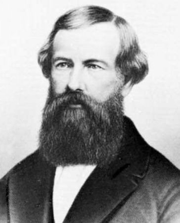
That story begins in the Jura Mountains; the year is 1941 and a Swiss engineer called George de Mestral and his dog have gone out hunting for the day.

On their return, De Mestral noticed that attached to his trouser legs and his dog’s fur were a number of burdock burs. Naturally curious he wondered how exactly the seeds stuck so effectively to both surfaces.

He detached some of the burs and took them home with him. Once there, he put them under a microscope and started to examine them.

The answer was immediately obvious. The burdock bur was covered in thousands of tiny tendrils, each of which ended in a tiny hook. It was these hooks that allowed the burs to catch on anything that rubbed against them.

Now, individual large hook and loop fasteners had been common for many years, but a material made up of tiny multiple hooks, which would allow objects to be quickly and easily “stuck” together and then as easily pulled apart was something completely new.

De Mestral set about trying to find a way to produce such a material. It would take him many years  to find an answer to the challenge.


His first prototypes used two cotton strips, with one of the strips having hundreds of randomly situated tiny hooks embedded.  The random placement allowed the hooks to be more likely to find a loop in the second side of fabric where the loops were also randomly sewn in. 

However, while the cotton strips worked well at first, the cotton hooks didn’t stand  to many attachments and detachments. 

He started trying other materials and eventually found that heat-treated nylon worked best, being very durable. His new production process involved producing two strips of material, both with loops, before cutting the tops off the loops on one side, creating hooks.

Though he now had a durable way to mimic the tiny hooks and loops sticking mechanism of the burdock seeds, he still had no way to mass-produce Velcro. It would take another ten years before he finally invented a loom that could automatically weave the nylon appropriately and then trim the loops. 

He applied for and got a patent in 1955.

For a name, De Mestral decided on a portmanteau word created from the French ‘velours’ (velvet) and ‘crochet’ (hook). The new brand name was Velcro.

Launched in the late 50s, it appeared in TIME in 1958. It got a huge PR boost when, a few years later, NASA astronauts used it to help secure pens, food packets and equipment they didn’t want floating away in zero gravity.

Nowadays Velcro is used in everything from blood pressure gauges to floor mats in cars and, of course, on the front of children’s shoes. It was used in the first ever human artificial heart transplant.

In 1984, David Letterman the American talk show host interviewed Velcro USA’s then director of industrial sales while wearing a Velcro suit. When the interview was over, he launched himself via trampoline onto a Velcro wall. A few years later, a New Zealand bar owner turned the Letterman stunt into the first “human fly” contests.

Now, I wonder what a fly could inspire.  

Two countries divided by the same brand

Two countries divided by the same brand

“Two countries divided by the same language” is a saying credited to George Bernard Shaw, Oscar Wilde and Winston Churchill, but whoever said it, I’m choosing to paraphrase them as “Two countries divided by the same brand” for a story about Mars’ Milky Way.

Milky Way is a brand name attached to two different products, the original in America and the second in the UK.

The American Milky Way bar is a candy bar made of chocolate-malt nougat topped with caramel and covered with milk chocolate, and is actually very similar to the Mars bar sold in other countries including the UK. The UK Milky Way bar is a confectionery (not candy) bar of whipped chocolate-malt nougat covered in milk chocolate but without the caramel layer.

Despite the fact that they are manufactured by Mars, the name Milky Way was not a deliberate choice as another cosmic reference but rather a nod to a popular milkshake produced in the 1930s.

The story starts with the birth of Franklin Clarence Mars on September 23, 1883 in Newport, Minnesota. As a child, Frank suffered from polio, which was to leave him disabled. One consequence of this was that Frank wasn’t  as mobile as other children and so spent a lot of time watching his mother bake and cook, including watching her make fresh chocolates.

His early interest led to his first business ventures and he built himself up as a pretty successful wholesaler in the Minneapolis/St. Paul area. In 1902, he married Ethel G. Kissack and, about a year later, his first son, Forrest, was born.

However, the candy business was changing. The Hershey Bar, the first mass-produced chocolate bar, had been introduced in 1900 and competition exploded.

Frank’s wholesale business went under.

In 1910, Ethel divorced Frank on the grounds that he was unable to support her. She won sole custody of Forrest and sent him to live with her parents in Canada. They would rarely see each other until many years later when their reunion would spark the idea that would ultimately make both their fortunes.

Frank remarried and, in 1920, after two further failures with candy wholesale businesses, he and his new wife, another Ethel, moved back to Minnesota where he moved into production of his own candies.

Building slowly from his special-recipe butter creams, he developed a candy bar with caramel, chocolate and nuts, which he called the Mar-O-Bar.

Meanwhile Forrest Mars had grown up. He left Canada, attended college at Berkeley and later, Yale before becoming a travelling salesman for Camel cigarettes.

In 1923, the two were to meet again though not under the most auspicious of circumstances.

In his drive for success, Forrest had gone a little over-the-top. He and his team had plastered ads for Camel right across the city, including all over various municipal signs. The local establishment weren’t impressed and he was arrested.

Forrest turned to his now prosperous father and asked for help. Frank bailed him out.


It was when they were catching up later, at a soda counter, that Forrest made the off-the-cuff suggestion. Looking down at his glass he said, “’Why don’t you put a chocolate-malted drink in a candy bar?’”

Frank took the suggestion seriously and started pondering on how he could achieve what his son had suggested.

Frank was already aware of what was known as “Minneapolis Nougat”, a variation of traditional nougat developed by the Pendergast Candy Company, made from whipped egg whites and sugar syrup.

He decided to try a bar of the Minneapolis Nougat, with an added  layer of caramel and dipped in chocolate. He called it Milky Way after the malted milkshake that had prompted Frank’s idea.

It had big advantages over bars made from solid chocolate, nuts and other ingredients. It was cheap to make and lightweight. It was also, perhaps more importantly, bigger than competing candies. “People walked up to the candy counter, and they’d see this flat little Hershey bar for a nickel and right next to it, a giant Milky Way for the same price. Guess which one they’d pick?” Forrest said.

Within a year, Mars’ sales jumped by tenfold, grossing about $800,000 (equivalent to about $11 million today). Forrest was to say later, “that damn thing sold with no advertising.”

Later on, the brand would  be supported by now famous advertising. In 1935, “The sweet you can eat between meals” campaign was launched. It was to become “At work, rest and play, you get three great tastes in a Milky Way.”

The relationship between father and son wasn’t always smooth. Forrest had ideas which he thought would make the business more successful. He tried to convince his father to give him control and let him expand to Canada. Frank refused and arguments continued.

In the end, Frank gave Forrest $50,000 and foreign rights to Milky Way.

Based in Europe, Forrest studied the competition and recognised that there were differences between the two continents’ tastes. He tweaked the recipe of the Milky Way and called the new confectionery the Mars Bar. It was a huge success.

Forrest, and Mars internationally, were to go on to launch a version of his new Mars Bar without the caramel layer.

He borrowed not only the “Milky Way” name but one of his father’s  old advertising campaigns “The sweet you can eat between meals”, reflecting the fact that, in the UK and elsewhere, the Milky Way is much lighter than a Mars bar (or a US Milky Way).


Footnote : Fun fact  –  the density of a UK Milky way is so low (0.88 g/cm3) that it floats when placed in milk.

Hoovering up an unbelievable offer

Hoovering up an unbelievable offer

Store janitor, James Murray Spangler, invented the first upright vacuum cleaner in 1908. Spangler suffered from asthma and suspected that the carpet sweeper he used at work was triggering attacks. He decided he would have to do something about it. He mounted an electric fan motor on a Bissell carpet sweeper and added a soapbox and a broom handle to create a basic suction-sweeper.

He applied for, and obtained, a patent for the Electric Suction Sweeper. He then set about producing it. He and his son assembled the machines and his daughter assembled the dust bags but production was very slow with only 2-3 machines produced in a week.

Spangler gave one of the few machines completed to his cousin Susan Troxel Hoover who used it at home. She was really impressed and immediately told her husband and son about it. Her husband, William Henry “Boss” Hoover and her son Herbert William Hoover, Sr. were leather goods manufacturers in North Canton, Ohio at the time.

Seeing an opportunity, the Hoovers bought the patent from Spangler in 1908, founding the Electric Suction Sweeper Company. They retained Spangler as a production supervisor with his pay based on royalties in the new business.

Spangler continued to contribute to the company until his death in 1915 when the company name was changed to the Hoover Suction Sweeper Company.

Hoover went from strength to strength and established a major base in the United Kingdom.

For most of the early  and mid-20th century, Hoover dominated the electric vacuum cleaner industry in the UK, to the point where the “Hoover” brand name became synonymous with vacuum cleaners and vacuuming in the United Kingdom and Ireland. People did the “hoovering” no matter what brand of vacuum cleaner they were actually using.

However, at the end of the 1980s and early 1990s, things weren’t going quite as well, a backlog of vacuum cleaners and washing machines was building up in Hoover’s warehouse.


In 1992, Brian Webb, Hoover vice-president of marketing, and Michael Gilbey, director of marketing services, led a team tasked with coming up with a campaign to boost sales.

They created what they thought would be a wonderfully simple, highly effective promotion – anyone buying Hoover products for at least £100 could claim two free flights to Europe. They calculated that they could buy all the tickets they needed cheaply through charter operators.

The tagline in the ads read, “Two return seats: Unbelievable.”

Response to the promotion was sky-high, stores were soon fighting to keep Hoover vacuum cleaners in stock. 

Hoover were elated at the sales figures and decided to expand the offer to include tickets to the United States.

As demand kept increasing, concerns started to emerge. People had caught on to just how good the offer was. Many were buying Hoover products that they didn’t want or need just to get plane tickets. Tickets to more exotic European locations generally cost more than £100 for a pair and a single ticket to the States were nearly always more than £100.

The travel operators retained by Hoover were unable to fulfil their contractual responsibilities in the light of enormous demand.

Despite a variety of “hurdles” that people had to overcome – receipts and application forms had to be sent off within 14 days; after that would-be travellers had to go through a lengthy procedure of nominating airports, dates and destinations, customers had to book accommodation and insurance through affiliated travel companies – Hoover couldn’t deliver on its promise.

As complaints mounted, the Hoover Holiday Pressure Group was established by Harry Cichy. They would fight on behalf of the flightless.

“To my astonishment, the Royal Mail van would turn up every day,” remembers Harry Cichy. “One bag to start with, then two bags, then three bags. We ended up with about 8000 members. One day a judge would phone up, next day a professor, the next minute it was a pig farmer from Gloucester.”

With the help of the pressure group, hundreds of customers began taking Hoover to court and soon Hoover found itself fighting legal battles up and down the country in the small claims courts.

The cases continued for six years after the promotion first started.

Looking back there were winners.

The 220,000 people who did eventually fly.

The airlines who supplied Hoover with thousands of extra seats – British Airways provided 20,000. Virgin supplied the same amount. A further 40,000 charter seats to Orlando, Florida had to be negotiated.

The VAT man was a winner too. It has been estimated that ‘he’ received an extra £4m, thanks to the unexpected sales.

There were losers.

The business cost to Hoover was enormous. The promotion had generated c£30m of sales but the cost of the tickets was £50m.

Brian Webb and Michael Gilbey were dismissed, along with William Foust, managing director of Hoover Limited and president of Hoover Europe.

The biggest loser however was the Hoover brand which was sold to competitor Candy for a knockdown price.

The Meatball or the Worm – which would you choose?

The Meatball or the Worm – which would you choose?

What is great graphic design?

As with many things, it would appear that beauty is in the eye of the beholder.  What the design industry sees as best practice may not always appeal to the people for whom that design has been created.

The story of the Meatball and the Worm, two NASA logos, is a perfect example.

The original NASA logo was a blue circle inscribed with “NASA” in a heavy serif font as well as a rocket, a sprinkling of stars and a curving red arrow. It was a mess by graphic design standards, hard to reproduce, difficult to scale and a bit of a mess. It was known affectionately as the ‘Meatball’.

In 1974, the Federal Graphics Improvement Program kicked off. It was an ambitious effort to revamp, update and improve the visual identity of a wide range of government agencies. One of the agencies to issue a brief was NASA.

Richard Danne and Bruce Blackburn, founders of New York design studio Danne & Blackburn, decided to respond. Their design recommendations centred on a red typographical logo, with smooth, thick lettering and crossbar-less A’s which were created to be reminiscent of rocket nosecones.

It was to win them the contract, and the flowing logo was adopted as the official identity. It was known as the ‘Worm’. 

Danne & Blackburn went on to create a broader document called the NASA Graphics Standards Manual. It outlined how the logo and the rest of the graphics system should be implemented on everything from spaceships to stationery. It is seen as a classic of its type, and many in the graphics industry believe it still has a lot to teach people about design and branding.

Despite the design industry’s acclaim for the manual and the logo itself, there was one problem with the smart, modern, clean design many, if not most, of NASA’s employees hated it.


Danne recalls, in his memoirs, a now-famous exchange between James Fletcher, NASA’s administrator at the time, and his deputy George Low during an early presentation of the graphics system:

Fletcher: I’m simply not comfortable with those letters, something is missing.

Low: Well yes, the cross stroke is gone from the letter A.

Fletcher: Yes, and that bothers me.

Low: Why?

Fletcher, after a long pause: I just don’t feel we are getting our money’s worth!

The Worm was a hard sell to an organisation that was full of engineers, not designers. NASA employees couldn’t care less about kerning and colour swatches, they like the more homely straightforward depiction of what NASA did.  

Design critic Alice Rawsthorn explained the different reactions in her essay ‘The Art Of The Seal,’ “If the meatball shows us what made NASA so thrilling — rockets, planets and sexy-sounding hypersonic stuff — the worm simply suggests it, and does so with such skill that it’s become the design purists’ favourite.”

Over the following two decades, the new logo was applied more and more consistently, however it wasn’t the most illustrious of times for NASA. It went from the glory days of moon landings and the “giant leap for mankind” to Skylab, the shuttle program, and the Challenger disaster.

By the early 1990s, many felt it was time that NASA needed another overhaul to lift things internally and raise public perceptions.

This time, there was to be no brief.

It was in 1992 and the new NASA administrator Daniel Goldin was paying a visit to Virginia’s Langley Research Centre.

As a centre of the old school it was perhaps not surprising that the Langley’s hangars had somehow avoided the design ‘police’ and so retained the pre-1975 NASA logo, the red, white, and blue ‘meatball’.

Langley’s director, Paul Holloway, never a fan of the worm, saw an opportunity. As Goldin recalled to The New York Times, “He said, ‘If you want to really excite NASA employees about changes coming, why don’t you tell them we’re going to de-worm NASA and bring back the meatball?’”

A White House official was traveling with the party and Goldin asked him whether he could, indeed, just re-‘meatball’ the space agency. The answer was ‘Yes’.

 So, in an address to Langley employees, Goldin announced the change: NASA was bringing back the meatball.

“They went wild,” Goldin says. “It was an incredible reaction.”

Which is why the NASA went backwards to signal its intent to move forward again and in doing so made its employees happy again.

The icons with holes in their heads

The icons with holes in their heads

The first one was born in 1978 and every sibling wore the same expression until 1989.

A recent estimate put their population at over 3.5 billion.

Who are they?


The Lego Minifigures, of course.

Now one of the most iconic toys in the world, they have their franchise and indeed their own blockbuster movie.

Their story though really begins in 1975 when a forerunner to the minifigure was released.

These figures were more ‘human shaped’ than basic bricks, but had solid torsos without separate movable arms or legs and their yellow heads were without any printed features.

They did had a small variety of ‘headpieces’ including caps, pigtail hair and cowboy hats

After a gestation period of three years, the first modern minifigures arrived in 1978, with seven different figures in Castle, Space, and Town Lego sets.

While these figures had arms and legs, for the next 11 years, all their heads had a single, simple facial expression, two solid black dots for eyes and a painted, black smile.

The 1989 Pirate saw the first arrival of figures with different facial expressions.

However one feature from the very original prototypes remained.

Every minifigure has a hole in the head or rather through the head.

Why is this?

The reason isn’t aesthetic or for construction reasons. It is, as Lego told website Gizmodo, “We added this hole on the top of the head just in case any kids got one of the heads stuck on their throat. That way they would be able to keep breathing.”

In other words so it could act like a windpipe in case it got stuck in one.

A nice bit of trivia but also no more than you would expect of a brand like Lego another demonstration of their on-going commitment to safety.

I vont a zoot like zat

I vont a zoot like zat

I’m always grateful to friends, colleagues and clients who introduce me to new stories and so a special thank you to Dr. Pablo Erat for telling me about this one.

 “SWIM 2.4 MILES! BIKE 112 MILES! RUN 26.2 MILES! BRAG FOR THE REST OF YOUR LIFE!”


Sounds like quite a challenge but, on February 18, 1978, 15 people decided they were up for it and they descended on Waikiki to attempt the feat and compete in the inaugural “Hawaiian IRON MAN Triathlon”.

Honolulu-based Navy couple Judy and John Collins had come up with the idea in 1977 when they thought of combining the three toughest endurance races in Hawaii—the 2.4 mile Waikiki Roughwater Swim, 112 miles of the Around-O’ahu Bike Race and the 26.2 mile Honolulu Marathon—into one event.

In 1981 the race moved from the tranquil shores of Waikiki to the barren lava fields of Kona on the Big Island of Hawaii. Along the Kona Coast, black lava rock dominates the panorama, and IRONMAN athletes now must battle not only the three challenges but the “ho’omumuku” crosswinds of 45 mph and 95 degree temperatures.

The move took the race to the back door of a woman by the name of Crystal Nylin.

Crystal was a triathlete herself and soon discovered one of the other challenges faced by the runners. The event might be three races in one but no-one had really thought about the clothes you needed to wear. There were swimsuits, running and cycling outfits but nothing specially conceived for triathletes. Changing in between disciplines was inconvenient and transition stages were like open-air changing rooms.


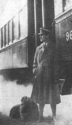
She began sewing pads into run shorts, experimenting with swim fabrics, attaching run singlets to bike shorts and eventually created one and two–piece uniforms.  She started selling them to the small but growing number of triathletes and set up shop in a space above Huggo’s, the famous restaurant and hangout for many of the triathletes and surfers on Hawaii.

All the trisuits were handmade by Crystal and she would insist that, if she was going to make a suit for an athlete, she wanted to spend 30 minutes with him or her to get to know that athlete’s personality.

A few days before the big race a woman walked in the little shop, saw a newly completed one-piece suit on the wall, pointed to it and said, “I want that suit”. However the woman was from Austria and while her English was perfect she still had a heavy accent so what Crystal actually heard sounded like  “I vant dat zoot” .

Crystal not only had a new customer but a name for her new company.

Further innovative designs followed including the padded Tri Brief, the drop tail, the aerodynamically designed Tri Jersey, and the 3″ inseam bike shorts coupled with colourful lycra fabrics and custom fitting and the business expanded rapidly. In 1996, Zoot Hawaii moved to the mainland and the product line has expanded since.

 Zoot Sports is now a global leader in endurance sports. Still focused on providing athletes with performance apparel, wetzoots, footwear and accessories or as they say on their website “pioneering innovative product solutions that cover the athlete from start to finish and head to toe”.


An innovation worth dying for?

An innovation worth dying for?

Have you ever worked for a brand for which you would be willing to risk your life? This man did. 

However there are plenty of brands which many people work for, for many years, but in which they personally don’t believe.

Perhaps the most famous example being Gerald Ratner.

Ratner had joined the family business in 1966 and by the 1980s had built it up to be an extremely successful chain of cut-price jewellers. The group consisted of Ratners, H. Samuel, Ernest Jones, Leslie Davis and Watches of Switzerland.

Based on their success, Ratner was asked to make a speech at a conference of the Institute of Directors at the Royal Albert Hall on 23 April 1991.

It was here he revealed what he really thought of the brand,

“We also do cut-glass sherry decanters complete with six glasses on a silver-plated tray that your butler can serve you drinks on, all for £4.95. People say, ‘How can you sell this for such a low price?’ I say, ‘Because it’s total crap’.”

He then went on to say that some of the earrings were “cheaper than an M&S prawn sandwich but probably wouldn’t last as long.”

Though he was later to claim he said these things as a joke, few were convinced. The value of the Ratner group dropped by around £500 million and the new company boss fired Ratner not long after. The group was re-named The Signet Group.

Elisha Otis was cut from a different cloth, as he was to prove in May 1854 at New York’s Crystal Palace, the main exhibition hall of America’s first World’s Fair.

Standing on top of a hoisting platform, high above the crowds at New York’s Crystal Palace, he called for everyone’s attention. As the heads turned around and up, he swung an axe and cut the rope supporting the platform. The platform began to drop and silence fell over the hall.


But the platform only dropped a few inches, and then came to a stop.

“All safe, gentlemen!” Otis announced to the crowd. Otis’ faith in his own revolutionary safety brake had been vindicated.

Elisha Otis had invented the safety elevator in 1852. He had solved the problem of rope failure that plagued elevators of that time. He installed a rope-break safety device called the safety brake (the equivalent of the modern safety gear) into the elevator. With the Otis safety brake, in the case of rope failure, a spring would force a ratchet to engage saw-tooth iron bars and safely secure the car.

 However he had only sold three, throughout the whole of 1853. Early 1854 was no better so he decided he would have to do something more radical to promote his invention. He decided to purchase a display at the forthcoming Crystal Palace Exhibition.

After his potential life threatening show, not only had his faith in his invention been  demonstrated but he was to get the commercial rewards he had sought.

He sold seven in the remainder of 1854 and then 15 in 1855.     

Otis is still the world’s leading lift company and it has installed elevators in some of the world’s most famous structures, including the Eiffel Tower, Empire State Building, the original World Trade Center, The Twilight Zone Tower of Terror, Petronas Twin Towers, Burj Khalifa, CN Tower and the Skylon Tower.

Many credit his invention as a crucial step in the path to skyscrapers as it enabled buildings and architects to reach higher and higher.

All because he truly believed in his idea and was willing to put his life on the line to prove it.


Footnote: Otis was clearly a clever marketer; he even used his business card as a selling card. As well as contact details it read, “Otis’ Life-Saving Steam Elevators are so constructed that if the rope breaks the platform cannot fall. Twelve men killed in this city (Yonkers, N.Y.) within four years with the old kind, and not one killed or hurt with Otis’ Excelsior Elevators.”

Why ALPHABET should be a good investment.

Why ALPHABET should be a good investment.

On Monday August 10th 2015, Google announced a major restructuring, creating what was effectively a new holding company with Larry Page and Sergey Brin at its helm.

The new entity would represent a collection of companies. The largest of which would be Google, slimmed down a bit. The others would be further away from the core internet business. Current examples would include their health efforts like ‘Life Sciences’ (that works on the glucose-sensing contact lens), and ‘Calico’ (focused on longevity). There would also be a focus on developing new ideas too.

Page and Brin announced that the name for this new company would be “Alphabet”.

Every new name has its detractors; I remember the comments about “Ace Ventura” when Accenture was announced so I wasn’t surprised to hear a few wags saying that the reason that Google had chosen Alphabet was an attempt to outdo the notion of “A is for Apple” and the A-Z in Amazon.

Conveniently, Alphabet would also come before both in any alphabetical index.


Amusing though the comments are, according to Larry Page they weren’t the reason why the name was chosen. He explained, “We liked the name ‘Alphabet’ because it means a collection of letters that represent language, one of humanity’s most important innovations, and is the core of how we index with Google search!”

However, like many good names that wasn’t the only reason, as Page went on to explain the other reason, “We also like that it means alpha-bet (Alpha is investment return above benchmark), which we strive for!”

All of which fits with Page’s and Brin’s stated intent of looking for Alpha-bets. “Sergey and I are seriously in the business of starting new things. Alphabet will also include our X lab, which incubates new efforts like Wing, our drone delivery effort. We are also stoked about growing our investment arms, Ventures and Capital, as part of this new structure”

So as a name for a company charged with finding and developing winning and highly profitable innovations, it makes sense and probably made the decision easier.

Music on the move – thanks to the opera-loving chairman

Music on the move – thanks to the opera-loving chairman

Created to answer a personal request of the honorary chairman, deemed unlikely to sell because it lacked a key product feature, with a name that senior management actively disliked, it went on to be a worldwide success that has helped shape the music industry, selling millions and millions of units worldwide. The name, like Hoover or Sellotape, came to define the category and is listed in the Oxford English Dictionary.

The brand is Sony Walkman.

Sony introduced the Walkman in 1979 but its origins can be traced back well before then.

In the 1950s the first portable cassette recorders came onto the market but, like many hi-tech products, they were targeted at a professional market and not the general public. The main users were journalists who could afford the high prices for the equipment and the specialised micro-cassettes, which at the time weren’t used in the music industry. Sony called theirs Pressman.

In 1962, Philips invented what became known as the Cassette tape, though it was more formally labelled and trademarked as a Compact Cassette. Philips’ subsequent decision, interestingly in the face of pressure from Sony, to license the format free of charge led it to become the dominant tape in the market.

1964 saw both the introduction of the first pre-recorded music cassettes and Philips Norelco Carry-Corder 150 portable recorder/player. By 1968, 85 manufacturers had sold over 2.4 million players despite the sound quality being only mediocre.

The quality improved dramatically by the early 1970s and the Compact Cassette went on to become increasing popular especially as it provided the ability to re-record.

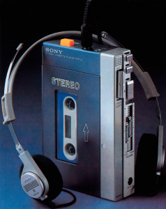
In 1978, Sony launched the TC-D5 a portable cassette player and, while general sales were limited due its high price, the lack of suitable lightweight headphones and its relatively large size, it did become a favourite amongst many of the  senior people in the Sony company due to its high quality sound.

One regular user was Masaru Ibuka, co-founder and then Sony’s honorary chairman. He used the player to listen to operas on his many airplane trips, but he still found the player too heavy for everyday use. He instructed the tape recorder division to create a smaller version for his personal use.

The division, led by Kozo Ohsone, modified a Pressman to do the job. They removed the record function and added stereophonic sound. Ibuka was immediately impressed and suggested that they bring a similar item to market.

It was a well-timed suggestion, Sony’s tape recorder division was flagging. So it was that in February 1979, Akio Morita, the company’s other co-founder, demanded that the engineers develop a player similar to the one they had developed for Ibuka but it had to be more commercially viable. He also told them that he wanted the product by June 21, 1979.


With that demand ringing in their ears and worried that the division would be consolidated into another one if they failed, the engineers went to work. They took a pragmatic approach and designed a portable tape player based on Ibuka’s modified Pressman player but using lower end components to bring the price down and encasing it in a small, stylish enclosure.

There was still the problem of the headphones. The current ones were far larger than the new player itself, they weighed more than 400 grams.

Luckily for the team, three years before, engineers in another division had designed a lightweight pair of headphones. They eliminated the large, enclosed earpiece and in its place put soft foam. They weighed in at around 50 grams. They were quickly added to the new design.

The device now needed a name.  “Walkman”, a variation on the Pressman was suggested. It is said that Morita hated the name “Walkman” and feared it would not catch on in the US and Europe.

Alternatives, like “Walky”, “Freestyle” and “Soundabout” were considered, and even tried in other countries, but ultimately the name Walkman stayed.

Having met the deadline, Sony announced their new product to the trade press on July 1st 1979 – a truly personal and truly portable 14 ounce, blue-and-silver cassette player with chunky buttons, headphones and a leather case. It also had a second earphone jack so that two people could listen in at once.

The reaction wasn’t encouraging. Some claimed that nobody would be interested in a tape player without a record function. Others pointed out that the most popular tape recorder of the time had sold less than 15,000 units, yet Sony had produced 30,000 units.

Sony however decided to press on and the Walkman was announced to the public.

It was the right decision.

A month after the Walkman became available in Japanese stores, it was sold out.

It went on to be a success right around the world. In the next decade, Sony sold 50 million units, and competitors who copied the idea sold millions more.