Browsed by
Month: October 2015

The Meatball or the Worm – which would you choose?

The Meatball or the Worm – which would you choose?

What is great graphic design?

As with many things, it would appear that beauty is in the eye of the beholder.  What the design industry sees as best practice may not always appeal to the people for whom that design has been created.

The story of the Meatball and the Worm, two NASA logos, is a perfect example.

The original NASA logo was a blue circle inscribed with “NASA” in a heavy serif font as well as a rocket, a sprinkling of stars and a curving red arrow. It was a mess by graphic design standards, hard to reproduce, difficult to scale and a bit of a mess. It was known affectionately as the ‘Meatball’.

In 1974, the Federal Graphics Improvement Program kicked off. It was an ambitious effort to revamp, update and improve the visual identity of a wide range of government agencies. One of the agencies to issue a brief was NASA.

Richard Danne and Bruce Blackburn, founders of New York design studio Danne & Blackburn, decided to respond. Their design recommendations centred on a red typographical logo, with smooth, thick lettering and crossbar-less A’s which were created to be reminiscent of rocket nosecones.

It was to win them the contract, and the flowing logo was adopted as the official identity. It was known as the ‘Worm’. 

Danne & Blackburn went on to create a broader document called the NASA Graphics Standards Manual. It outlined how the logo and the rest of the graphics system should be implemented on everything from spaceships to stationery. It is seen as a classic of its type, and many in the graphics industry believe it still has a lot to teach people about design and branding.

Despite the design industry’s acclaim for the manual and the logo itself, there was one problem with the smart, modern, clean design many, if not most, of NASA’s employees hated it.


Danne recalls, in his memoirs, a now-famous exchange between James Fletcher, NASA’s administrator at the time, and his deputy George Low during an early presentation of the graphics system:

Fletcher: I’m simply not comfortable with those letters, something is missing.

Low: Well yes, the cross stroke is gone from the letter A.

Fletcher: Yes, and that bothers me.

Low: Why?

Fletcher, after a long pause: I just don’t feel we are getting our money’s worth!

The Worm was a hard sell to an organisation that was full of engineers, not designers. NASA employees couldn’t care less about kerning and colour swatches, they like the more homely straightforward depiction of what NASA did.  

Design critic Alice Rawsthorn explained the different reactions in her essay ‘The Art Of The Seal,’ “If the meatball shows us what made NASA so thrilling — rockets, planets and sexy-sounding hypersonic stuff — the worm simply suggests it, and does so with such skill that it’s become the design purists’ favourite.”

Over the following two decades, the new logo was applied more and more consistently, however it wasn’t the most illustrious of times for NASA. It went from the glory days of moon landings and the “giant leap for mankind” to Skylab, the shuttle program, and the Challenger disaster.

By the early 1990s, many felt it was time that NASA needed another overhaul to lift things internally and raise public perceptions.

This time, there was to be no brief.

It was in 1992 and the new NASA administrator Daniel Goldin was paying a visit to Virginia’s Langley Research Centre.

As a centre of the old school it was perhaps not surprising that the Langley’s hangars had somehow avoided the design ‘police’ and so retained the pre-1975 NASA logo, the red, white, and blue ‘meatball’.

Langley’s director, Paul Holloway, never a fan of the worm, saw an opportunity. As Goldin recalled to The New York Times, “He said, ‘If you want to really excite NASA employees about changes coming, why don’t you tell them we’re going to de-worm NASA and bring back the meatball?’”

A White House official was traveling with the party and Goldin asked him whether he could, indeed, just re-‘meatball’ the space agency. The answer was ‘Yes’.

 So, in an address to Langley employees, Goldin announced the change: NASA was bringing back the meatball.

“They went wild,” Goldin says. “It was an incredible reaction.”

Which is why the NASA went backwards to signal its intent to move forward again and in doing so made its employees happy again.

The icons with holes in their heads

The icons with holes in their heads

The first one was born in 1978 and every sibling wore the same expression until 1989.

A recent estimate put their population at over 3.5 billion.

Who are they?


The Lego Minifigures, of course.

Now one of the most iconic toys in the world, they have their franchise and indeed their own blockbuster movie.

Their story though really begins in 1975 when a forerunner to the minifigure was released.

These figures were more ‘human shaped’ than basic bricks, but had solid torsos without separate movable arms or legs and their yellow heads were without any printed features.

They did had a small variety of ‘headpieces’ including caps, pigtail hair and cowboy hats

After a gestation period of three years, the first modern minifigures arrived in 1978, with seven different figures in Castle, Space, and Town Lego sets.

While these figures had arms and legs, for the next 11 years, all their heads had a single, simple facial expression, two solid black dots for eyes and a painted, black smile.

The 1989 Pirate saw the first arrival of figures with different facial expressions.

However one feature from the very original prototypes remained.

Every minifigure has a hole in the head or rather through the head.

Why is this?

The reason isn’t aesthetic or for construction reasons. It is, as Lego told website Gizmodo, “We added this hole on the top of the head just in case any kids got one of the heads stuck on their throat. That way they would be able to keep breathing.”

In other words so it could act like a windpipe in case it got stuck in one.

A nice bit of trivia but also no more than you would expect of a brand like Lego another demonstration of their on-going commitment to safety.

I vont a zoot like zat

I vont a zoot like zat

I’m always grateful to friends, colleagues and clients who introduce me to new stories and so a special thank you to Dr. Pablo Erat for telling me about this one.

 “SWIM 2.4 MILES! BIKE 112 MILES! RUN 26.2 MILES! BRAG FOR THE REST OF YOUR LIFE!”


Sounds like quite a challenge but, on February 18, 1978, 15 people decided they were up for it and they descended on Waikiki to attempt the feat and compete in the inaugural “Hawaiian IRON MAN Triathlon”.

Honolulu-based Navy couple Judy and John Collins had come up with the idea in 1977 when they thought of combining the three toughest endurance races in Hawaii—the 2.4 mile Waikiki Roughwater Swim, 112 miles of the Around-O’ahu Bike Race and the 26.2 mile Honolulu Marathon—into one event.

In 1981 the race moved from the tranquil shores of Waikiki to the barren lava fields of Kona on the Big Island of Hawaii. Along the Kona Coast, black lava rock dominates the panorama, and IRONMAN athletes now must battle not only the three challenges but the “ho’omumuku” crosswinds of 45 mph and 95 degree temperatures.

The move took the race to the back door of a woman by the name of Crystal Nylin.

Crystal was a triathlete herself and soon discovered one of the other challenges faced by the runners. The event might be three races in one but no-one had really thought about the clothes you needed to wear. There were swimsuits, running and cycling outfits but nothing specially conceived for triathletes. Changing in between disciplines was inconvenient and transition stages were like open-air changing rooms.


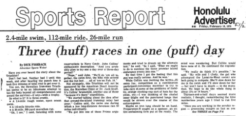
She began sewing pads into run shorts, experimenting with swim fabrics, attaching run singlets to bike shorts and eventually created one and two–piece uniforms.  She started selling them to the small but growing number of triathletes and set up shop in a space above Huggo’s, the famous restaurant and hangout for many of the triathletes and surfers on Hawaii.

All the trisuits were handmade by Crystal and she would insist that, if she was going to make a suit for an athlete, she wanted to spend 30 minutes with him or her to get to know that athlete’s personality.

A few days before the big race a woman walked in the little shop, saw a newly completed one-piece suit on the wall, pointed to it and said, “I want that suit”. However the woman was from Austria and while her English was perfect she still had a heavy accent so what Crystal actually heard sounded like  “I vant dat zoot” .

Crystal not only had a new customer but a name for her new company.

Further innovative designs followed including the padded Tri Brief, the drop tail, the aerodynamically designed Tri Jersey, and the 3″ inseam bike shorts coupled with colourful lycra fabrics and custom fitting and the business expanded rapidly. In 1996, Zoot Hawaii moved to the mainland and the product line has expanded since.

 Zoot Sports is now a global leader in endurance sports. Still focused on providing athletes with performance apparel, wetzoots, footwear and accessories or as they say on their website “pioneering innovative product solutions that cover the athlete from start to finish and head to toe”.


An innovation worth dying for?

An innovation worth dying for?

Have you ever worked for a brand for which you would be willing to risk your life? This man did. 

However there are plenty of brands which many people work for, for many years, but in which they personally don’t believe.

Perhaps the most famous example being Gerald Ratner.

Ratner had joined the family business in 1966 and by the 1980s had built it up to be an extremely successful chain of cut-price jewellers. The group consisted of Ratners, H. Samuel, Ernest Jones, Leslie Davis and Watches of Switzerland.

Based on their success, Ratner was asked to make a speech at a conference of the Institute of Directors at the Royal Albert Hall on 23 April 1991.

It was here he revealed what he really thought of the brand,

“We also do cut-glass sherry decanters complete with six glasses on a silver-plated tray that your butler can serve you drinks on, all for £4.95. People say, ‘How can you sell this for such a low price?’ I say, ‘Because it’s total crap’.”

He then went on to say that some of the earrings were “cheaper than an M&S prawn sandwich but probably wouldn’t last as long.”

Though he was later to claim he said these things as a joke, few were convinced. The value of the Ratner group dropped by around £500 million and the new company boss fired Ratner not long after. The group was re-named The Signet Group.

Elisha Otis was cut from a different cloth, as he was to prove in May 1854 at New York’s Crystal Palace, the main exhibition hall of America’s first World’s Fair.

Standing on top of a hoisting platform, high above the crowds at New York’s Crystal Palace, he called for everyone’s attention. As the heads turned around and up, he swung an axe and cut the rope supporting the platform. The platform began to drop and silence fell over the hall.


But the platform only dropped a few inches, and then came to a stop.

“All safe, gentlemen!” Otis announced to the crowd. Otis’ faith in his own revolutionary safety brake had been vindicated.

Elisha Otis had invented the safety elevator in 1852. He had solved the problem of rope failure that plagued elevators of that time. He installed a rope-break safety device called the safety brake (the equivalent of the modern safety gear) into the elevator. With the Otis safety brake, in the case of rope failure, a spring would force a ratchet to engage saw-tooth iron bars and safely secure the car.

 However he had only sold three, throughout the whole of 1853. Early 1854 was no better so he decided he would have to do something more radical to promote his invention. He decided to purchase a display at the forthcoming Crystal Palace Exhibition.

After his potential life threatening show, not only had his faith in his invention been  demonstrated but he was to get the commercial rewards he had sought.

He sold seven in the remainder of 1854 and then 15 in 1855.     

Otis is still the world’s leading lift company and it has installed elevators in some of the world’s most famous structures, including the Eiffel Tower, Empire State Building, the original World Trade Center, The Twilight Zone Tower of Terror, Petronas Twin Towers, Burj Khalifa, CN Tower and the Skylon Tower.

Many credit his invention as a crucial step in the path to skyscrapers as it enabled buildings and architects to reach higher and higher.

All because he truly believed in his idea and was willing to put his life on the line to prove it.


Footnote: Otis was clearly a clever marketer; he even used his business card as a selling card. As well as contact details it read, “Otis’ Life-Saving Steam Elevators are so constructed that if the rope breaks the platform cannot fall. Twelve men killed in this city (Yonkers, N.Y.) within four years with the old kind, and not one killed or hurt with Otis’ Excelsior Elevators.”