Browsed by
Month: December 2014

Brave – the 1964 edition

Brave – the 1964 edition


It’s 1964 a time of social turmoil and racial tension in the USA.


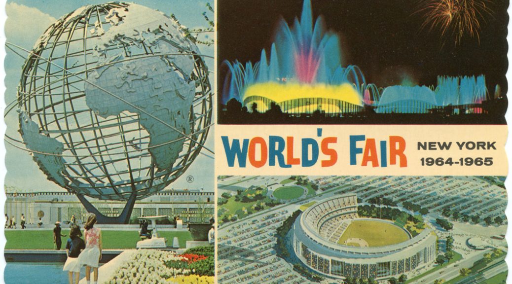
It’s the year of the World Fair which will be held in New York.


It’s a key period in the history of SC Johnson which was at the time only a comparatively small Wisconsin-based cleaning products manufacturer. 


Herbert Fisk Johnson, the third generation SC Johnson leader presents his idea to the board. He suggests they build a Johnson Wax pavilion at the Fair in which they will screen a specially made film. It will use the firm’s entire marketing budget on this prestigious but one-off event. 

But that is not all, he doesn’t want the film to be about the company or any of its products, he wants it to be about the simple joy of being alive. His vision is a film designed to celebrate the common ground between different cultures by tracing how children in various parts of the world mature into adulthood. It was a message of “peace through understanding”. The film will be shot in various locations across the United States, Europe, Asia and Africa and feature a multi-racial cast.

Not surprisingly the other company executives weren’t immediately enamoured with the idea. They had numerous questions and challenges.


After politely listening to all their concerns, H.F. thought for a while and then simply said; “Some decisions are only for the brave.”

The final 20 minute film was co-directed by Francis Thompson and Alexander Hammid and used an experimental method consisting of three separate 18-foot screens. Unlike the Cinerama process that joined three screens into a single unbroken entity, the three screens were separated by one foot of space.

“To Be Alive!” quickly became one of the fair’s most popular exhibits. The public loved it. People lined up around the block to get a chance to see a screening.

Years later Fisk Johnson, H.F.’s grandson recalled “My grandfather, H.F. Johnson, Jr. wanted to counter the negativity that was so apparent during this period of American history.  He succeeded, bringing a new generation a message of hope and optimism.”

“It really put SC Johnson on the map … even though we didn’t market our products at all” says Kelly Semrau, SC Johnson’s head of sustainability.

In the dark and broken – creating a design icon

In the dark and broken – creating a design icon

Coca-Cola is a brand which has long been associated with Christmas so it seemed like a Coke story would be a good choice for my post today. 

In the dark and broken

“A bottle which a person could recognize even if they felt it in the dark, and so shaped that, even if broken, a person could tell at a glance what it was.” That was the brief that was issued by the Coca-Cola Company when it launched a competition among its bottle suppliers to create a new and distinctive bottle shape in 1915.

At one of the suppliers, the Root Glass Company of Terre Haute, Indiana, Chapman J. Root, president decided to delegate the project to members of his supervisory staff, including the company auditor T. Clyde Edwards, the plant superintendent Alexander Samuelsson, and Earl R. Dean, a bottle designer and the supervisor of the bottle moulding room.

After much thought they came up with the idea of basing the bottle’s design on one of the key ingredients of Coca-Cola. In particular they decided it should be based on either the coca leaf or the kola nut.

There was one slight snag, none of the team knew what either of those ingredients looked like.

So Dean and Edwards decided to go to the Emeline Fairbanks Memorial Library but their search was unsuccessful as neither were unable to find any information about coca or kola.

With time running out Dean found and was inspired by a picture of the gourd-shaped cocoa pod in the Encyclopaedia Britannica. He made a rough sketch of the pod and returned to the plant to show Root and explained to Root how he could transform the shape of the pod into a bottle.

Root liked the idea and gave Dean his approval to further develop the idea

A second complication now faced Dean. There was an upcoming scheduled maintenance of the mould-making machinery, so Dean needed to work at speed.

Over the next 24 hours Dean sketched out a concept drawing which was approved by Root the next morning. Dean then managed to create a bottle mould and produce a small number of the prototype bottles before the glass-moulding machinery was turned off.

A design patent was issued on the bottle in November 1915.

At the 1916 bottlers’ convention, Dean’s “contour” bottle was chosen as the winning design but the prototypes never made it to production.

On the prototypes the middle diameter was larger than the base diameter and this made it unstable as it went down the conveyor belts. Dean resolved this final issue by decreasing the bottle’s middle diameter and the bottle went made it to the market later in 1916.

By 1920, the contour bottle became the standard for the Coca-Cola Company. Today, the contour Coca-Cola bottle remains one of the most recognized packages on the planet…”even in the dark”.

As a reward for his efforts, Dean was offered a choice between a $500 bonus or a lifetime job at the Root Glass Company. He chose the lifetime job and kept it until the Owens-Illinois Glass Company bought out the Root Glass Company in the mid-1930s. 

The Doreen Gray of Baking

The Doreen Gray of Baking

She has been writing recipes since the 1920s, has appeared on countless radio stations and has had her portrait painted on numerous occasions over the years – but like Dorian or perhaps Doreen Gray, she doesn’t seem to age and in fact often appears younger than she did in earlier portraits.

She, or at least her picture, has been brought into just about every household in the US and many more across the world. In 1945, she was the best known woman in the US next to Eleanor Roosevelt.

Her name is Betty Crocker, and she doesn’t really exist.

Betty’s birth, if you can call it that, can be traced back to a promotion run by the Gold Medal flour brand in 1921. The promotion allowed people to “win” a pin cushion in the shape of a flour sack.

Along with their entries, thousands of people sent in questions about their baking problems. The advertising manager at the time, Sam Gale, decided it would be good PR to answer the questions, but felt that it would be more appropriate and believable for responses to come from a woman. So Betty Crocker was born, in the form of a signature.

In 1924, she acquired a voice and appeared on the radio for the first time. In 1936, her portrait was painted for the first time, and by 1941 she was known to nine out of ten American housewives.

20 years on from there, Betty Crocker’s New Picture Cookbook offered its readers advice such as: “Think pleasant thoughts while working and a chore will become a labour of love”. Fast-forward another 25 years and the focus of her cookbook became time-saving in the kitchen and producing “lively meals”.

The Betty Crocker brand name still appears on over 100 different products, while her appearance continues to change with the times.

For an advertising campaign in the 1990s, photographs of 75 different Becky Crocker users were taken and blended together to create a single, more modern and hopefully realistic image for the brand icon. She truly is a woman of many faces.


The story behind the sherry so many drink at Christmas

The story behind the sherry so many drink at Christmas

For this week’s story I have two colleagues to thank.

When I asked what brands were associated with Christmas, David Holland suggested Harveys Bristol Cream and a little research uncovered this little story about the origins of its name.

Dawn Childs who did the original illustrations for “The Prisoner & The Penguin” duly obliged again with the cartoons to help illustrate the tale.