Browsed by
Month: January 2014

Here’s a story you can backrub – sorry google

Here’s a story you can backrub – sorry google

Having posted a short story about one of the mega web brands – Facebook – earlier in the week, it reminded me that one of the  stories that is actually in the book is the story about Larry Page and Sergey Brin chose the name – Google and perhaps i could share that…

The backrub, the spelling mistake and the 100 zeros

Here’s a story you can backrub – sorry, Google.

Google founders Larry Page and Sergey Brin met at Stanford University in 1995. By 1996, they had built a search engine that used links to determine the importance of individual

webpages. Their name for the fledgling product was “Backrub”

On reflection, Brin and Page decided that perhaps Backrub wasn’t such a good name. It was certainly unusual and original, but they wanted something that related in some way to the service they aimed to provide in linking millions of webpages together.

After much consideration, they chose a word for a huge number: a ‘Googol’. A googol is the term for the number represented by 1 followed by 100 zeros.

Brin and Page liked it so much because it truly reflected the scale of their ambition.

It also fitted with what was to become their mission statement: “To organize the world’s information and make it universally accessible and useful.” 

However, the name was to undergo one further and unexpected change.

One of their first investors was far-sighted enough to see the potential in what they wanted to do, but his spelling wasn’t quite as good as his business sense. When he wrote out his

cheque, he made it out to “Google”.

Brin and Page liked it and the new name stuck.

And the moral is that not all mistakes produce bad results.


The cartoon isn’t directly related to the story but it is about a googol and i’ve always loved Peanuts

Blue – a short story about Facebook

Blue – a short story about Facebook

Why is Facebook blue? 

Brand identities come in all shapes and sizes so of all the colours he could have chosen why did  Mark Zuckerberg choose blue?

Well the story is that Mark Zuckerberg is actually red-green colour blind. This means that blue is the colour that he can see the best, or in his own words “Blue is the richest colour for me – I can see all of blue.”


The accident, the neighbourhood walk and the future President

The accident, the neighbourhood walk and the future President

For those of you who love brand trivia, your question for the week is :

What is the connection between Wheaties, Chesterfield Cigarettes and Jelly Belly beans?

The answer is of Ronald Reagan.

Wheaties helped launch his Hollywood career, his fame helped make his a desirable famous endorser of Chesterfiled cigarettes and then Jelly Belly became his jelly bean of choice as he overcome craving when giving up  smoking.


The reason for the question…  In an earlier blog I told the story of Jelly Belly (Friends in high places) and followed it up with part of the Wheaties story (Friends in high places Part II) , so for nayone interested here is a fuller version of the origins of Wheaties. 

The accident, the neighbourhood walk and the future President

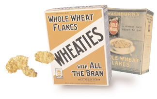
Wheaties, that most American of breakfast cereals known as the ‘Breakfast of Champions’, was the unlikely outcome of an accident and owes much of its success to a leisurely neighbourhood walk. Ronald Reagan is in its debt as it helped launch his Hollywood career (and we know where that ultimately led).

The Wheaties story begins in 1921, in Minneapolis, where a health clinician was mixing a batch of bran gruel for some of his patients when he accidentally spilt some of the mixture onto a hot stove.

Before he could clean it up, the gruel started to crackle and sizzle and soon turned into crisp brown flakes. Rather than throwing the flakes away, he tried one, liked it and immediately started to wonder if there might be a bigger opportunity for his new ‘product’.

He took the remaining crisped flakes to the nearby Washburn Crosby Company. The head miller there, George Cormack, liked the flakes too and could see their potential, if only he could overcome one major problem. The flakes were very weak and crumbled easily. His challenge was to keep the taste and crispness but to strengthen the flakes enough to prevent them from turning to dust inside a cereal box. 

36 attempts later Cormack at last had what he thought was the perfect flake.

The name came courtesy of a companywide contest and the winner was Jane Bausman, the wife of the export manager. ‘Wheaties’ was chosen over numerous other suggestions, including ‘Nutties’ and ‘Gold Medal Wheat Flakes’.


Nine years on, the brand was doing pretty well when, enter stage left, Sam Gale, Marketing Manager taking an autumnal walk through his neighbourhood. It was a beautiful day and very peaceful but something was nagging away in Sam’s brain, something was amiss.

Then, in a flash of inspiration reminiscent of the famous Sherlock Holmes’ “dog in the night” moment, Sam realised what was wrong. Just as Holmes had noticed that what was wrong was the absence of the dog barking, Sam realised what was wrong was the absence of people.  Despite it being a beautiful day nearly everyone seemed to be indoors. 

Sam was intrigued as to what was keeping them inside on such a day. He soon realised that what they were doing was listening to the World Series Baseball match on their radios.

In a further leap of imagination he immediately recognized a new opportunity, here was an opportunity for Wheaties to reach a huge audience. 

So began Wheaties sponsorship of baseball broadcasts, which soon evolved into featuring athletes on the box, and the creation of hero “Jack Armstrong —All American Boy.”

One of the side benefits of the contract for that original sponsorship for the broadcasts of all Minneapolis Millers games on WCCO radio was a large advertising poster at the ball park. Wheaties needed a slogan. Knox Reeves, an advertising executive at a Minneapolis-based agency, was given the task. 

He took out a pad and pencil, sketched a Wheaties box, thought for not more than a minute, and then wrote “Wheaties – The Breakfast of Champions.” One of America’s most famous advertising slogans created in moments – it has lasted for years.

Gale and the rest of the Wheaties team were delighted, the slogan had caught on and the baseball broadcasts were immensely popular throughout the 1930s.

Though the broadcasts were originally only on just one station, they soon expanded to 95, spreading to teams and cities throughout the whole country.  One of those stations was W.H.O. in Des Moines, Iowa. W.H.O. decided to run a competition and find their most popular broadcaster, for whom the prize would include an all expenses trip to Hollywood and a screen test. 

The winner was a young broadcaster named Ronald “Dutch” Reagan. He left for Hollywood and never returned. “Wheaties – the Breakfast of Film Stars and Presidents” – now there’s a thought. 

 ———-

and of course while he was he became one of the stars who promoted Chesterfield cigarettes 

Necessity is the mother of innovation

Necessity is the mother of innovation

Ashley Vincent | National Geographic

Not all innovations are carefully planned and researched some are born out of necessity, and caution is thrown to the wind. The story of how National Geographic started using photographs is one such tale.

11 pages short

On January 13, 1888, 33 academics, scientists, explorers and their wealthy patrons gathered at the Cosmos Club, a private club then located on Lafayette Square in Washington, D.C., to organize “a society for the increase and diffusion of geographical knowledge.” 

After preparing a constitution and a plan of organization, the National Geographic Society was incorporated two weeks later on January 27. Gardiner Greene Hubbard became its first president.

The first issue of National Geographic Magazine, as it was originally called, was published nine months later in October 1888. 

It was however a rather drab affair, a somewhat dry scientific journal, 98 pages long, wrapped in a brown paper cover and containing articles such as “The classification of Geographical Forms by Genesis” and “The Survey of the Coast” The only form of illustration were some meteorological maps which broke up the black and white text.

For the next sixteen years the format hardly changed, nor did the limited circulation.

However late in December 1904, the printer told the then editor Gilbert H. Grosvenor that he still had 11 pages to fill for the January edition and what did he want him to do. 

In somewhat of a panic, Grosvenor grabbed a package he had recently received from the Imperial Russian Geographical Society. It contained some of the first photographs of Lhasa, Tibet, which at the time was considered one of the world’s most exotic places.


He selected 11 of them and sent them off to the printer with instructions to use them to fill the empty pages, despite the fact that he was worried that in doing so he might face criticism or even be fired.

When the edition came out in January 1905, rather than criticism he was heaped with praise. People stopped him in the street and at the Society to congratulate him. The format for the magazine was forever changed and circulation began to climb. It was to earn Grosvenor the epithet; “the father of photojournalism”.

Outstanding photography remains a hallmark of the magazine to this day. Indeed the front cover portrait of 13-year-old Afghan girl, Sharbat Gula, which first appeared on the June 1985 edition has become one of world’s magazine’s most recognizable images.


Take pride in your logo

Take pride in your logo

A great logo is something that any company should take pride in, but one company can do more than that, given it has had a pride as its logo.

That company is of course MGM and  it has had a pride of lions that have played a starring role in its logo over the years.

This is their story…

A roaring success

The famous logo of Metro-Goldwyn Mayer is not one lion, but has in fact been a whole pride of them. 

In 1917, Samuel Goldwyn asked studio publicist Howard Dietz to design a logo for Goldwyn Picture Corporation. In the end Dietz chose to use a lion as the studio’s mascot, paying tribute to his alma mater, Columbia University and its athletic teams, the Lions. The specific inspiration was said to be the school’s fight song “Roar, Lion, Roar.” Deitz also wrote the motto “Ars Gratia Artis,” which is Latin, meaning “Art for Art’s Sake.”

When Goldwyn Pictures merged with Metro Pictures Corporation and Louis B. Mayer Pictures, the newly formed MGM retained the lion based logo. 

Slats (1917-1928) was MGM’s first lion. He was born at the Dublin Zoo and was trained by Volney Phifer, Hollywood’s premier animal trainer of the time. The pair toured the country to promote MGM’s launch and became close. So much so that when Slats died in 1936, Phifer had the body sent to his farm and buried it there, marking the grave with a granite slab and a pine tree to “hold down the lion’s spirit.”

Telly and Coffee were briefly used in Technicolor tests, but both had short-lived careers

Jackie (1928 -1956) was the next in line and was the first MGM lion to be heard as well as seen. Jackie introduced MGM’s first sound production, White Shadows in the South Seas, with his roar. 

Jackie came from an acting animal dynasty. His mother, Stubby, was part of a performance troupe, and his grandmother, Mamie, was one of the first animals to ever appear on film in the U.S. Jackie was a performer in his own right too, appearing in over 100 movies.

On one hand it is said that Jackie was unlucky. He was involved in two train wrecks, an earthquake, a boat sinking, an explosion at the studio, and a plane crash that left him stranded in the Arizona wilderness for several days. On the other hand and perhaps not surprisingly given he survived all those instances, most thought chance was on his side and he deserved his nickname “Leo the Lucky.”

Apparently Jackie wasn’t much of a looker and his trainer Melvin Koontz called him “the ugliest cat you had ever seen.” In 1931, Jackie retired from the studio and went to live at the Philadelphia Zoo. He died in February 1935 after battling a heart problem for several months. 

Tanner followed Jackie and reigned through what is known as the “Golden Age of Hollywood”. Tanner was used on almost all Technicolor MGM films from 1934–1956 and the cartoons from late 1935–1958. There were one or two notable exceptions however including The Wizard of Oz (1939) which had the scenes In Oz in colour, but had the opening and closing credits (and indeed the Kansas scenes) in sepia-toned black-and-white, so they used the old black and white footage of Jackie.

Tanner was described as MGM’s “angriest” lion by Koontz because he snarled all the time. 

George followed Tanner but had a relatively short lived stint and doesn’t appear to have made that much of an impression, as one of the only things that is said about him is that he had a bigger mane than the other lions.

Starting in 1957 and still going strong Leo is the not only the current lion but is MGM’s longest-serving lion. Like Jackie, Leo’s performances weren’t limited to his appearance in the logo, he appeared in several Tarzan movies, the Tarzan TV series, and other filmsas well. 

Though known universally as Leo, this may or may not have been his actual name. He was purchased from an animal dealer, Henry Treffich, and it seems no-one knew what he was actually called. Leo was the name used by someone at the studio and it stuck.

In the same way that Tanner didn’t appear on all the films during his period as the mascot, Leo has sometimes been replaced.

In the late sixties there was a short lived attempt to replace the ‘live lion with a circular still graphic image of a lion known as “the stylized lion”. This logo appeared on three films including Stanley Kubrick’s masterpiece 2001: A space odyssey (1968). However that logo was soon dropped for MGM films and Leo was reintroduced. The stylized lion was however retained by the MGM Records division.

Other more humorous stand-ins have also made occasional appearances over the years including the Marx Brothers, a lion with blood-dripping fangs in The Fearless Vampire Killers, a croaking frog, Mimsie the Cat the in The Mary Tyler Moore Show, a meowing Tom in Tom and Jerry and Animal in The Great Muppet Caper.


New Year, old story…

New Year, old story…

The Passenger & the Penguin

One of the reasons I wrote The Prisoner & The Penguin was that I realised that the best brands were increasingly recognising how important telling their own stories could be, and I wanted to encourage other brands to do the same.  

Other reasons included the fact that I liked the stories themselves and saw their potential as educational tools for marketers and businessmen alike.

So I was delighted when just as I finished reading “Quiet” by Susan Cain which is published by Penguin, I came across the penultimate page in the book and their was another great little story about the Penguin brand. It read…

‘He just wanted a decent book to read…

Not too much to ask, is it? It was 1935 when Allen Lane, Managing Director of Bodley Head Publishers, stood on a platform at Exeter railway station looking for something good to read on his journey back to London. 

His choice was limited to popular magazines and poor-quality paperbacks – the same choice he faced every day by the vast majority of readers, few of whom could afford hardbacks. Lane’s disappointment and subsequent anger at the range of books generally available led him to found a company – and change the world

“We believed in the existence in this country of a vast reading public for intelligent books at a low price, and staked everything on it”

The quality paperback had arrived – and not just in bookshops. Lane was adamant that his Penguins should appear in chain stores and tobacconists, and should cost no more than a package of cigarettes. 

Reading habits (and cigarette prices) have changed since 1935, but Penguin still believes in publishing the best books for everyone to enjoy. We still believe that quality books published passionately and responsibly make the world a better place.’

And the moral is every brand should have at least one story and be proud to tell it. What’s your brand’s story?