America’s Great Depression caused untold misery but the necessity of trying to feed your family drove people on. I have already written the tale of how Charles Darrow developed what was to become Monopoly after losing his job at a sales company. However, he was not the only person for whom necessity was the mother of invention.
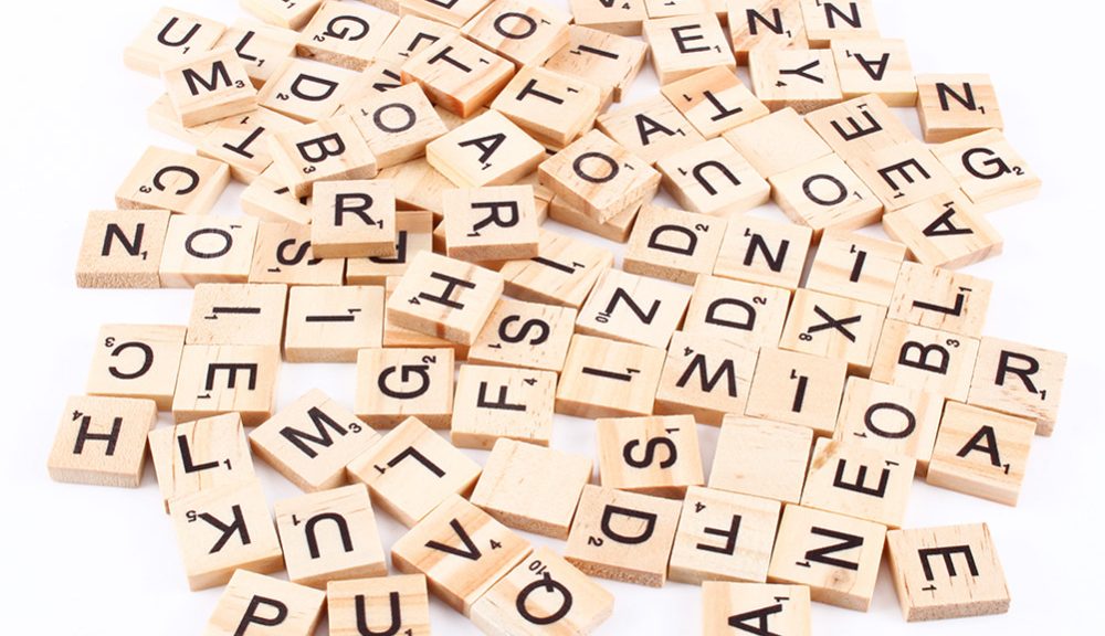
In 1933, Alfred Mosher Butts lost his job as an architect and decided to try his hand at developing a board game.
He set about it methodologically and while he might not have known it, he followed many of the principles of best practice in innovation – analyse the market, identify the best opportunity area, develop something new that fits into that space, prototype it and test it.
He began by analysing the set of current board games. Sitting in his apartment in Queens, New York City, he determined that there were three broad types of game – move games like chess, number games such as bingo, and word games, of which he could think of just one example, Anagrams.
Having identified word games as his opportunity area, he decided he wanted to create a game that combined the vocabulary skills of crossword puzzles and anagrams, with an additional element of chance.
He analysed the front pages from a number of papers including the New York Herald, to assess the frequency with which each letter in the alphabet appeared. He then used this information to help him decide how many tiles a letter should appear on and how many points it ought to worth.
The game, which Butts originally called Lexico, was the result. In its first few years, it was in fact to go under a variety of different names including ‘It’ and ‘Criss-Cross words’.
The first prototypes had boards that were hand drawn using Butts’ architectural drafting equipment, reproduced by blueprinting and pasting on folding checkerboards. The tiles were also hand-lettered, then glued to quarter-inch balsa and cut to match the squares on the board.
His wife Ninawas an ex-schoolteacher and his first guinea pig. She beat Alfred at his own game – he claimed he was never any good at spelling. It has been reported that Nina once notched up nearly 300 points using the word ‘quixotic’ across two triple-word scores.
Soon the couple were gathering friends and neighbours to play in the hall of the local Methodist church but the game stubbornly remained a local hit.
By mid-1934, Butts had sold just 84 handmade sets at a loss of $20. Every major games’ manufacturer turned it down, and his application for a patent met the same fate.
Luckily for Butts, the economy began to pick up and he was able to resume his old job at the architectural firm.
He and his friends still continued to play the game and sold a few sets over the years.
One was bought by James Brunot who, when he retired from his day job in 1948, approached Butts with an offer to make and sell the game. Butts agreed.
Brunot came up with a new name, ‘Scrabble’, and lodged a successful copyright application.
Unfortunately the game was not an immediate success. In 1949, Brunot made 2,400 sets and lost $450.
Over the next 2-3 years the brand grew, but only slowly.
Then and not in any marketing textbook??, the brand had a stroke of luck. In 1952, the president of Macy’s department store happened to see a Scrabble game in progress while holidaying in Florida. He liked what he saw and decided to stock some in his store.
The game took off almost immediately and Macy’s was soon selling 6,000 sets a week.
 By 1952, Brunot realised he could not make the games fast enough to meet the growing interest, so licensed a well-known game manufacturer, Selchow & Righter, to market and distribute them in the United States and Canada.
In 1972, Selchow & Righter bought Brunot out. Brunot received $1.3 million and Butts got $265,000.
Today, more than 150 million Scrabble sets have been sold in 29 languages. Scrabble has become a cultural icon, appearing in episodes of Seinfeld and The Simpsons, and in lyrics sung by Kylie Minogue and Sting.
Footnote 1: Butts used some of his earnings to buy the farmhouse in upstate New York where he had grown up, and there, while in his late seventies, he created a second game. It too was a word game. His choice of name however showed that he had more to learn as an innovator. He called his new invention – Alfred’s Other Game.

Footnote 2: Butts was a resident of Jackson Heights, New York, when he invented the Scrabble. There is now a special street sign at 35th Avenue and 81st Street in Jackson Heights that is stylised using letters, with their values in Scrabble as a subscript to commemorate the association.
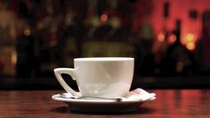 By the beginning of the twentieth century, coffee drinking was no longer a luxury. Melitta Bentz and her husband, Hugo, were among the many people who had recently started to drink it daily, with their breakfast or with cakes and while chatting in the afternoon.
 She was sure that there must be a better way. She started experimenting and, in the end, her homework paid off – or perhaps that should be her son’s homework paid off!
 Melitta decided to set up a business and, on 20 June 1908, The Kaiserliche Patentamt (Imperial Patent Office) granted her a patent . On 15 December 1908, she registered her own company “M. Bentz”, for the sale of coffee filters with the trade office in Dresden. Her starting capital was 72 Reichsmark cents. The company headquarters was a room in her apartment.
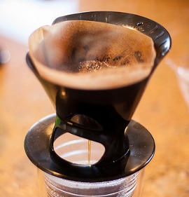 In the 1930s, Melitta revised the original filter, tapering it into the shape of a cone and adding ribs. This created a larger filtration area, allowing for improved extraction of the ground coffee.
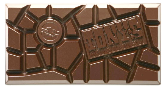
 The first bars were part of a programme storyline with van de Keuken following the whole supply chain from bean to bar to demonstrate that a slave free chocolate bar could be made. The first batch sold out within an hour of coming onto the market so Dekker decided to start a company.

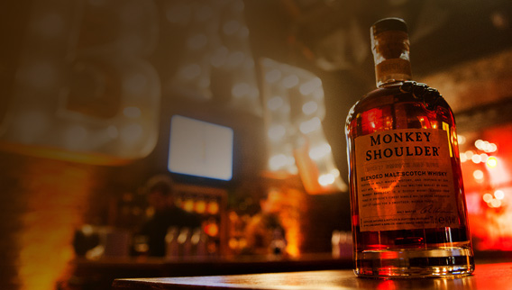

 Monkey shoulder is a slang term for a physical condition that afflicted a number of maltmen who used to work long shifts, turning the barley by hand using large wooden shovels. The long and arduous work had a tendency to cause their lead arm to hang down a bit like a monkey’s and people would refer to it as monkey shoulder.


 The business also “fires” around 3,500 customers a year who don’t play by their rules – making too many calls to customer service, or asking for too many exceptions to procedures.
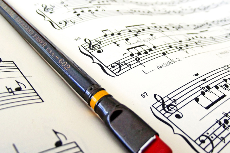


 The problem stemmed from one of those distinctive features – the extended eraser ferrule. It required special clips that were only produced on a custom-made machine. When Eberhard Faber was acquired and became part of Faber-Castell in 1994, they discovered that the machine was broken.
 Other fans started looking for alternatives and interest focused on the Palomino’s range of premium pencils, which many felt provided a comparable performance to the Blackwing. Palomino were soon being asked to consider reviving the iconic brand, reviving the old unique look. Luckily Palomino founder and CEO, Charles Berolzheimer, whose family’s roots in the pencil industry date back to the mid 19th century, was able to use his unique supply relationships to get permission to re-introduce the Blackwing pencil. They introduced their new Blackwing both in its original form (the “602”) for true devotees, writers and everyday users, as well as a slightly modified version with a slightly softer lead for artists. The new “Palomino Blackwing 602” sold in packets of 12 for about $20.