Frisky and Playful
![]()
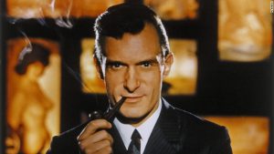
Hugh Hefner died this week so I thought about a story about the Playboy brand was an appropriate way for me to commemorate the event – so here is one I wrote for my first book of brand fables – “The Prisoner and the Penguin”
Frisky and Playful
In 1959, a reader sent a letter off to his favourite magazine but instead of writing an address he drew a picture of a rabbit wearing a bow-tie on the envelope. The letter was duly delivered to the Playboy offices.
Things had obviously come a long way in the six years since Hugh Hefner launched his new magazine.
The title for the magazine was supposed to be “Stag Party,” but an unrelated outdoor magazine, Stag, contacted Hefner and informed him that they were legally protecting their trademark and would take him to court if he were to launch his magazine under that name.
Hefner, his wife Millie and co-founder and executive vice president Eldon Sellers met to discuss the problem and to seek a new name. Among others they considered “Top Hat”, “Gentleman”, “Sir'”, “Satyr”, “Pan” and “Bachelor” before Sellers suggested “Playboy”. Sellers’ mother had worked for a short-lived firm called Play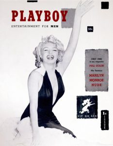 boy Automobile Company in Chicago and remembering it Sellers thought it might be a good alternative.
The first issue of the now re-christened magazine was produced in Hefner’s Hyde Park kitchen and published in December 1953. The first centerfold was famously Marilyn Monroe, although the famous cover photo had originally been taken for a calendar and not specifically for Playboy.
It was an immediate sensation; it sold out all of its 50,000 circulation within a matter of weeks, which despite his confidence must have delighted Hefner. He had in fact been so worried that the original issue did not carry a date, as he was unsure if or when there would be a second issue.
After this initial success the next challenge was to create a brand identity. While the most obvious solution would have been to develop a stylish image of a ‘playboy’, Hefner and his team realised that there were already two other magazines on the newsstands that used men as their icons – Esquire and The New Yorker. So rather than face another threat of a lawsuit Hefner decided something different was needed.
‘I selected a rabbit as the symbol for the magazine because of the humorous sexual connotation, and because he offered an image that was frisky and playful. I put him in a tuxedo to add the idea of sophistication.
There was another editorial consideration, too. Since both ‘The New Yorker’ and ‘Esquire’ use men as their symbols, I felt the rabbit would be distinctive; and the notion of a rabbit dressed up in formal evening attire struck me as charming, amusing… and right.’
![]()
The actual logo, depicting the stylized profile of a rabbit wearing a tuxedo bow tie, was created by art designer Art Paul who said some years later “If I had any idea how important that little rabbit was going to be, I probably would have redrawn him a dozen times to make certain. I was doing him justice, and I suppose none of those versions would have turned out as well as the original. As it was, I did one drawing and that was it. I probably spent all of half an hour on it.”
And the moral is that design should signify something you stand not just identify your name. What does your identity communicate about your brand?